Design sprint – UX
Sharing Readly

Brief
How might Readly increase their sharing of articles from the app?
Commissioner
Readly – unlimited magazines in one app
Duration
4 days
My role
User researcher, Prototyper, User tester, UI
Team
Maria Gadh, Max Lindevall, Isac Lissåker, Sanna Nielsen, Anders Schough
Process
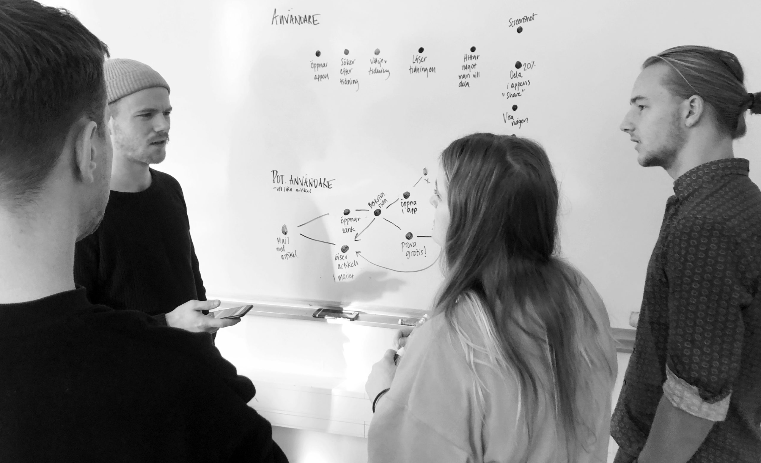
Research
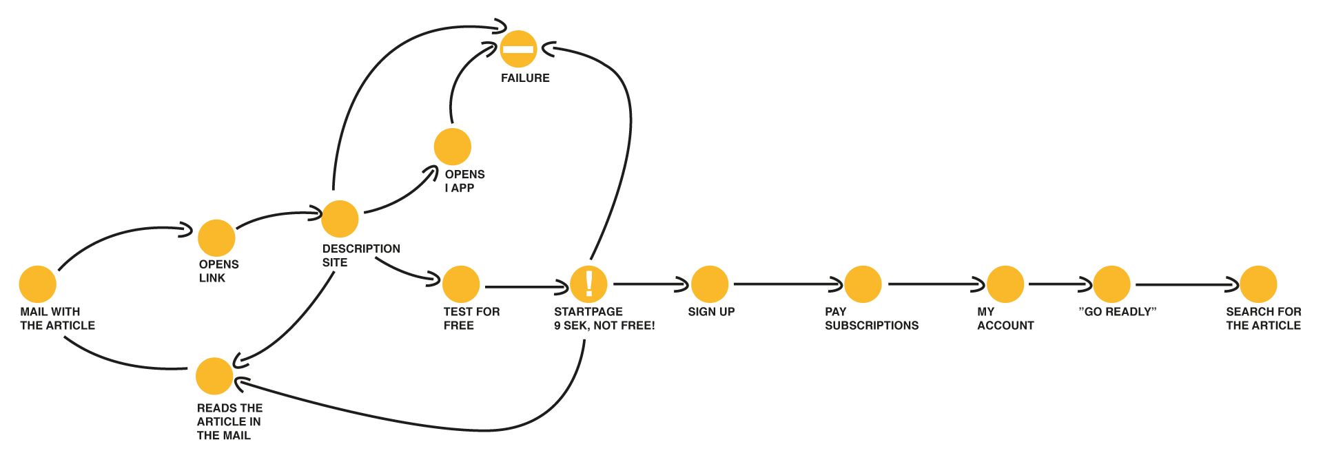
Reserched showed that there was difficulty in finding the sharing function, due to the unrecognizable icon and the placement in the app.
When we looked at the customer journey we realized that there was another fact that we hadn't thought about before – the recipient of the shared article.
Key insights
The goal was to increasing the amount of sharing to generate new users.
Simplifying the sharing function itself was not enough, the recipient had far to complicated on-boarding, which limited new users from being generated.
Solution
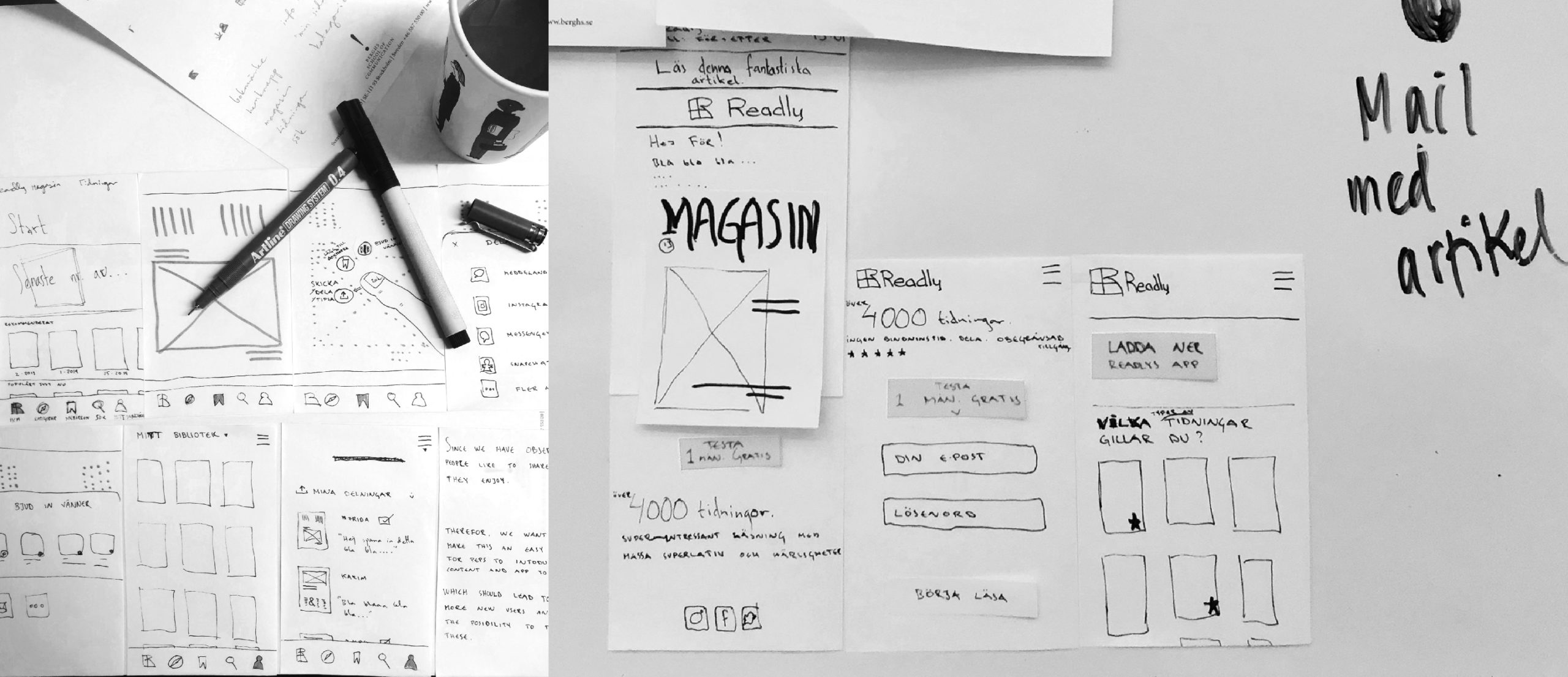
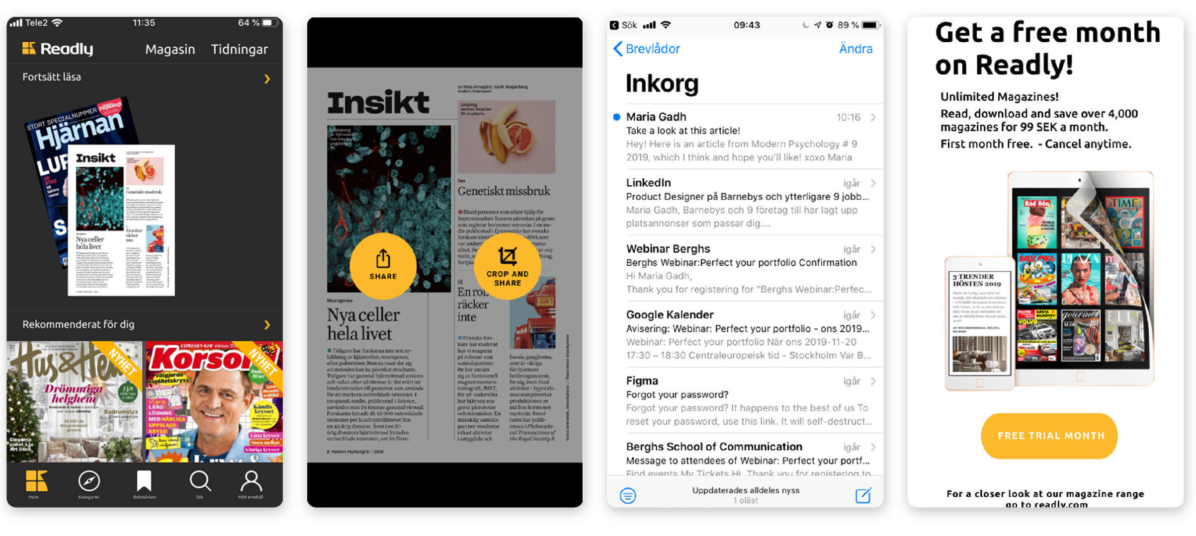
By using known icons and moving the sharing function closer to sight, we made sharing a simple and natural part of the Readly experience.
We made the received content more inviting and shortening the on-boarding significantly for the recipient.
WHAT YOU GET IS WHAT YOU READ
An insight and research driven person, who prototypes her steps on the target group to challenge the confirmation bias.
FIND ME